
Milkyway@home Science
Webpage in Other Languages
|
Index
Other questions? Contact us at astro[at]cs.lists.rpi[dot]edu! Science SummaryMilkyway@home studies the history of our galaxy by analyzing the stars in the Milky Way galaxy's Galactic Halo. This includes searching for elusive dark matter. This research is done by mapping structures of stars orbiting the Milky Way - many these structures are actually "tidal debris streams," or dwarf galaxies that are being pulled apart by our Galaxy's superior gravitational field. The orbits, shapes, and compositions of these dwarf galaxies provide vital clues to the history of our Galaxy, as well as to the distribution of dark matter. Additionally, Milkyway@home has recently started developing the "N-body" sub-project, which creates simulated dwarf galaxies and "shoots" them into the Milky Way's gravitational field. We allow the simulated dwarf galaxy's initial conditions to vary until the final simulated dwarf matches what we see in actual halo structures. In other words, we are trying to match dwarf galaxy models to real data, in order to learn more about what is (and what isn't) possible for our Galaxy. For both projects, we use data from the Sloan Digital Sky Survey(see below) Here's a visualization by Shane Reilly, showing the Milky Way galaxy (center blue-to-red spiral), a model for the disrupted Sagittarius dwarf galaxy (blue), and an example wedge of SDSS data (yellow). 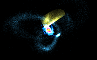 Source: Shane Reilly, Milkyway@home
Until the late 1990's, the Galactic halo was thought to smooth and uninteresting, and Heidi Newberg's 2002 paper ("The Ghost of Sagittarius and Lumps in the Halo of the Milky Way") proved that the halo is actually full of these tidal debris (the halo is "lumpy"). Since then, astronomers have been actively searching for and characterizing these structures. So Milkyway@home is doing science in a field that's barely over ten years old - this is cutting edge astronomy, and we want you to be a part of it! Introduction: The Shape of the Milky WayWhat is the Milky Way? The Milky Way is our home galaxy, one of BILLIONS of known galaxies in the Universe. In addition to our Sun, the Milky Way contains around 400 billion other stars - that's about 57 stars for every human being alive on Earth today! Even though that sounds big, the Milky Way is actually thought to be an average-sized galaxy. (For more information on galaxies, see the Wikipedia article:Galaxy.) The Milky Way is currently understood to be a barred spiral galaxy (Hubble type SBbc) that is 100,000 light-years across - that is, it takes 100,000 years for light (the fastest thing known to exist) to travel from one end of the Milky Way to the other. For comparison, light takes 8 minutes to get from the Sun to the Earth. While the light-year is a physically useful unit, astronomers tend to use "parsecs" when measuring distances. A parsec (short for "parallax-second") is 3.26 light-years, and is related to one of the most precise methods of determining distances to other stars ("parallax"). In Galactic astronomy, we work with truly astronomical distances, as so we use "kiloparsecs" (kpc), or thousands of parsecs, as our distance units. The radius of the Milky Way, then, is 15 kpc, with our Sun being 8 kpc from the center of the galaxy. The modern view of the Milky Way galaxy contains four major components: The disk, bulge, stellar halo, and dark matter halo: 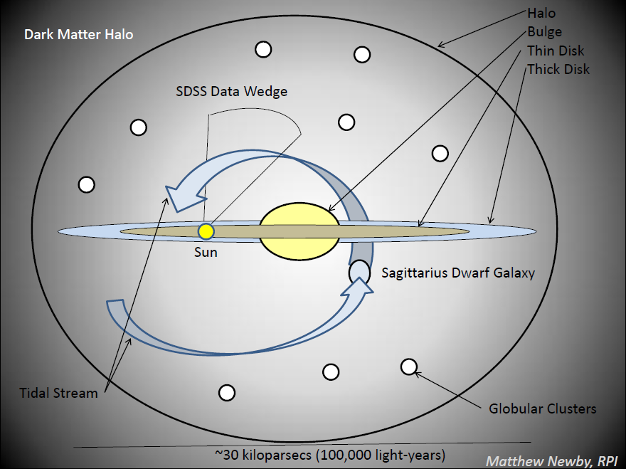 Source: Matthew Newby, Milkyway@home
The disk is the most obvious component of the galaxy, and is considered to consist of two parts: the thin disk and the thick disk. The thin disk is about 0.3 kpc thick and contains almost all of the dust, gas, and young stars (including the Sun) in our Galaxy. The thick disk is about 1 kpc thick, and marks the thickness where star densities drop dramatically. The bulge lies at the center of the disk, has a radius of only a few kpc, and contains both old and young stars. Recently, it was determined that the bulge contains a prominent bar. Additionally, a super massive black hole resides at the center of the galaxy - with a mass equal to that of 4 million Suns! The stellar halo is a nearly spherical spheroid of stars that surrounds the entire galaxy. The density of stars in the halo is very low compared to densities found in the disk, and the majority of halo stars are found within 30 kpc of the galactic center. The stellar halo is the focus of Milkyway@home. The dark matter halo is the most mysterious of all the galactic components. Information from galactic rotation curves, galaxy collisions, and dark matter simulations all strongly indicate that there is a large amount of invisible mass surrounding every galaxy. Modern astronomers hope to gain clues about the shape and composition of the dark matter halo from structures in the disk and stellar halo. "Dark" Matter Dark Matter is the mass that is needed to make up for the unseen mass in physical observations. Although other solutions to these discrepancies have been proposed, such as modifications to Newton's and/or Einstein's theories of gravitation, dark matter is the only solution that describes all of the observed scientific anomalies simultaneously. Therefore, understanding dark matter is currently one of the major goals of science. To understand what "dark" matter is, we need to understand "light" matter (the stuff we are used to). "Light" matter is made of baryons, which are particles that are made of quarks. The most important consequence of baryons being built of quarks is that they interact electromagnetically. This means that light, which is an electromagnetic wave, can interact with baryons. Light waves have a large variety of wavelengths that make up the electromagnetic spectrum (See Figure, from Wikipedia). Depending on how the baryons are arranged, baryonic matter will absorb, reflect, or emit certain wavelengths of light. In fact, all baryonic matter will emit some wavelengths of light based on its temperature - stars, for example, are very hot, and so they can emit visible light. The higher an object's temperature, the shorter the wavelengths that can be emitted. Therefore, all baryonic matter "glows" at certain wavelengths (including humans! We glow in the infrared). 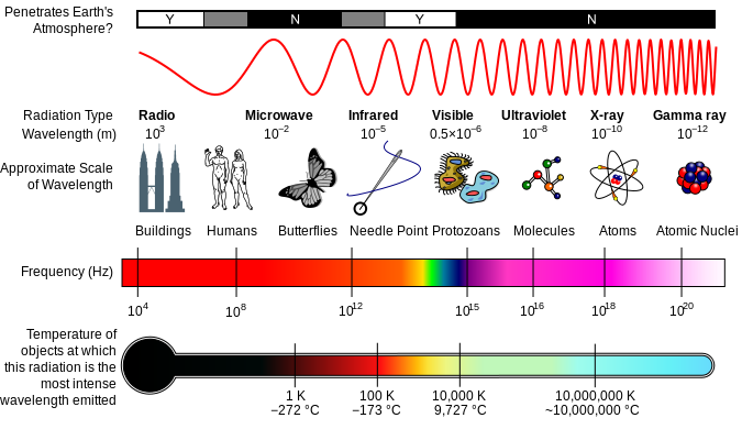 Source: Wikimedia Commons Source: Wikimedia CommonsDark matter is different. Dark matter does not emit light at any wavelength. Dark matter does not absorb light, and it doesn't reflect it, either. Dark matter, then, does not interact electromagnetically at all. This is why it is "dark:" light waves can never even know it's there. Since dark matter doesn't interact with light, the only way that we can currently study it is through gravity. By studying the distribution of baryonic matter (stars and gas) in the Milky Way, we will gain insight into the arrangement and composition of dark matter. Milkyway@home furthers this goal by studying stars in the stellar halo, using data from the Sloan Digital Sky Survey. Part I: Sloan Digital Sky Survery (SDSS)The Sloan Digital Sky Survey is a five-color, deep-field survey that covers a large part of the the sky. It started taking data from its 2.5-meter telescope at Apache Point Observatory in the year 2000, and will release its last dataset in 2014. All of the almost 500 million objects in the database are available to the public. For more information about SDSS, see the SDSS website. If you want to explore SDSS data yourself, check out the SDSS DR9 Navigate Tool. 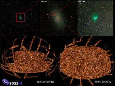 Source: SDSS-III
Part II: How do we Search for Dark Matter?So, what can the Galactic halo tell us about dark matter and the structure of the Milky Way? Astronomers seek to understand the Galactic potential of the Milky Way, which is a measure of how the Milky Way's gravity affects other objects, and therefore, a measure of the distribution of mass (matter) in the galaxy. If we can compare the galactic potential to the potential of the known (baryonic) matter, we can then determine the potential of the dark matter - which will tell us how dark matter is distributed in the Milky Way. Astronomers use the physics of gravity to determine the potential of the Galaxy. In a simple analogy, let's look at how someone would go about investigating the potential of our sun. The Sun is massive and spherical, and so its potential will be simple - 'spherically symmetric,' in physics lingo. The measured strength of this spherically symmetric potential depends only on the mass of the Sun, and the distance that you are away from it. The spherically symmetric gravitational potential of the Sun leads to Kepler's Law. If we plot the velocity (or orbital speed) of planets orbiting the Sun versus their radius (or orbital distance) from the Sun, we get the rotation curve of the Solar System. For a system obeying Kepler's Law, such as the Solar System, a clearly "falling" (decreasing with distance) rotation curve is observed: 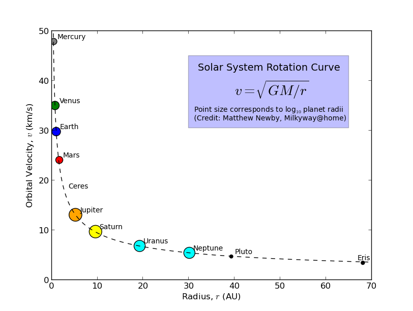 Source: Matthew Newby, Milkyway@home
A Galaxy is a bit more complicated. Since there's not just one big mass at the center, the rotation curve should look different then that of the Solar System. When astronomers add up all of the light from stars in a Galaxy (even other Galaxies), we find that most of the light comes from near the center, with the amount of light decreasing with distance from the center. From this "light curve," we can calculate the distribution of light matter, which lets us calculate what the rotation curve of a Galaxy should look like. What we find is that the curve should fall with distance - but when astronomers actually measure the rotation curve of the Milky Way (and other Galaxies), we find that it is almost flat, and not falling much at all! 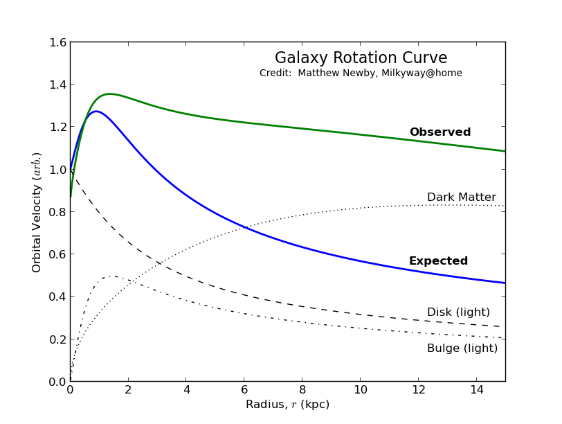 Source: Matthew Newby, Milkyway@home
The rotation problem actually goes back to the 1930's, with an astronomer named Fritz Zwicky. Zwicky measured the velocities of galaxies rotating around a galaxy cluster, and concluded that there was "missing mass" that wasn't being seen in the cluster. In the 1970's, astronomer Vera Rubin measured the rotation curves of other Galaxies, and showed definitively that there is, indeed, more mass in each galaxy than can be seen. So, how do we find this dark matter? Our best bet seems to be gravity. Using gravitational lensing, or the fact that dense pockets of matter can cause the path of light to warp around them, astronomers can actually map dark matter within very dense galaxy clusters, such as the Abell Cluster:  Source: Hubblesite.org
But these clusters are very far away from us, and we can't see the details. So we really want to figure out where dark matter is in our Galaxy, and then figure out what it is from there. The stars in the Galactic halo orbit outside the disk of the Milky Way, and so their orbits will tell us what the Milky Way's gravitational potential looks like, and therefore, where the mass is. But these stars are just far enough away that they don't seem to move at all - if you don't know how something is moving, it's really difficult to figure out what its orbit is. This is where tidal streams save the day! These streams, formed from dwarf galaxies being torn apart by the Milky Way's gravity, trace continuous orbits around the Galaxy. So, even if we can't see the individual stars move, we can follow the line of the tidal stream to determine their direction of motion. From there we can determine the stars' orbits, and then we can determine the distribution of dark matter! Now the trick is figuring out exactly where these streams are. While this may seem easy, in reality the streams are mixed in with regular halo stars and even with other streams! Also, there are errors in the data, especially as you get further out in the halo, and these need to be accounted for. All of this means that we have to apply detailed mathematical analysis to the stars, which in turn leads to a very difficult computational problem... Part III: Milkyway@homeSeparation This is where Milkyway@home comes in. The goal of the "Separation" or "Stream Fit" part of Milkyway@home is to do this analysis - figuring out exactly where the big tidal streams are in the big jumble of stars that is the Galactic halo. To do this, we had to create a mathematical model of SDSS data stripes (see Nathan Cole's PhD Thesis [pdf]) and a method for finding the best way to fit this model to the actual SDSS data. Each separation work unit is a single evaluation of the model - that is, a single set of parameters for the model that are checked against the real data. Each of these work units then determines the likelihood that the given set of model parameters matches the data, and sends this to our server. Our server then uses this information (see below) to determine the next set of parameters to try, and generates a new work unit - this continues until we see very little improvement in the likelihoods, and we can then declare a parameter set that gives the best likelihood of matching the data (This type of problem is called a maximum likelihood problem). In other words, the separation project searches for the best way to describe the streams in the Galactic halo. Once we have that, we get a very accurate description of the tidal streams in a given SDSS wedge. Current Progress: We've managed to finish describing the North Galactic cap ("above" the Galactic disk) part of the Sagittarius dwarf galaxy's tidal stream, and the results will be published in the Astrophysical Journal soon (March-April 2013). Some figures from that paper: The Sagittarius stream separated from the background data (see this thread for more info): 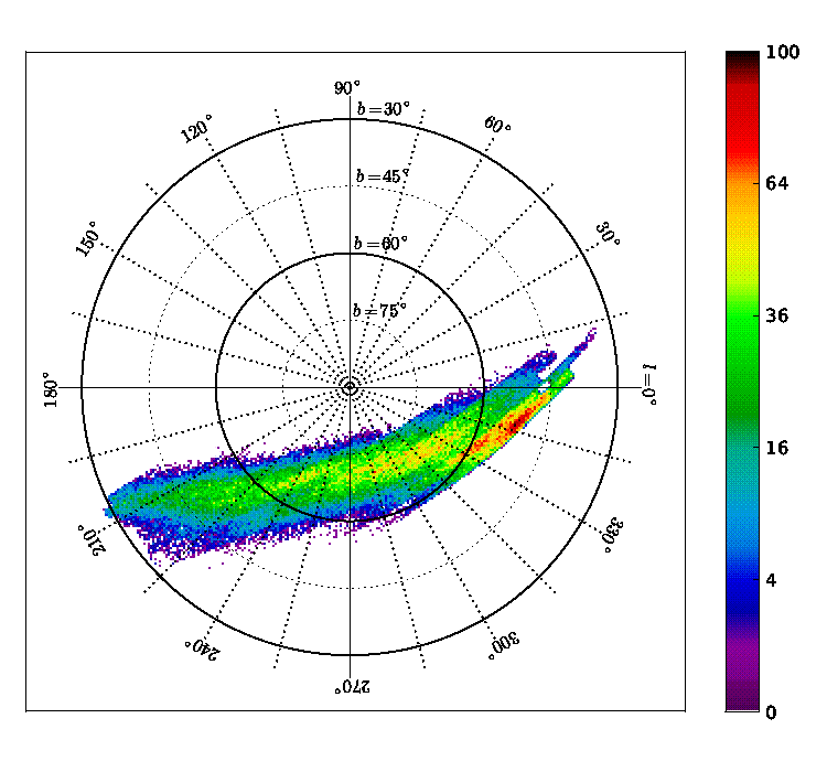 Source: Newby et al. (2013), Astrophysical Journal
The path of the Sagittarius stream around the Galaxy, represented by an arrow for each SDSS stripe that we analyzed. See this thread for more info: 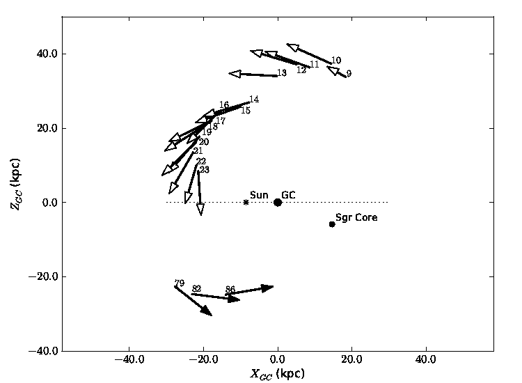 Source: Newby et al. (2013), Astrophysical Journal
Work In-Progress: Milkyway@home is currently studying the North Galactic cap streams that are not Sagittarius - we are re-analyzing the same data, but with the Sagittarius stream removed. This is necessary because, with Sagittarius, the other streams were too faint to accurately find. Additionlly, we are gearing up to start working on the SDSS Data Release 8 data, which fills in some of the areas in the Southern Galactic Cap. Finally, once all of this is done, we will analyze the stellar spheroid - the stars in the Galactic halo that do not belong to dwarf galaxy tidal streams. Understanding the stellar spheroid is a current hot topic in astronomy, so a thorough analysis will make a big splash! If all goes well, the Separation project should be complete in late-2013 to mid-2014. N-body The N-body project on Milkyway@home simulates dwarf galaxies colliding with (or being disrupted by) the Milky Way. This disruptions often result in tidal streams, like Sagittarius. The goal of the N-body project is to match simulated dwarf galaxies to real dwarf galaxy data, and thereby constrain the properties of the Milky Way galaxy's gravitational potential (as well as the properties of the dwarf galaxies). Here's an example of a dwarf galaxy being disrupted by the Milky Way's gravity (the Milky Way is not shown, and would be at the center of the picture):  Source: Shane Reilly, Milkyway@home
Work In-Progress: The N-body project is currently under development, and is almost stable. Soon, we'll be running test data through through it to verify that the techniques work, then we'll start crunching simulations against real data! Eventually, we hope to to make N-body the main project on Milkyway@home, and to add GPU support. Part IV: ResultsEstimate of the Mass and Radial Profile of the Orphan-Chenab Stream's Dwarf Galaxy Progenitor Using MilkyWay@home (Mendelsohn et. al 2022) Using stellar data from the Sloan Digital Sky Survey (SDSS) and the Dark Energy Camera (DEC), we were able to use MilkyWay@home's N-body project to generate a mass estimate of the Orphan-Cehnab's original progenitor dwarf galaxy, the first time such an estimate has ever been made from tidal debris alone. The Orphan-Chenab Stream (OCS) is a tidal stream that was discovered in 2006 while examining the Sagittarius Stream. Because no progenitor core could be detected within the stream, it was originally named the 'Orphan Stream'. However, in 2018, the southern half of the stream was detected and named Chenab. Thus, the stream was renamed 'Orphan-Chenab'. We found the total mass of the OCS's progenitor to be roughly 2 x 10⁷ solar masses, with a mass-to-light ratio of 73.5 (about 98.6% dark matter). This is interesting because other mass estiamtes of the OCS progenitor placed this value somewhere between 108 and 109 solar masses. This is likely because these mass estimates used velocity dispersions for their calculation and assumed the system to be in equilibrium. However, we have also shown that the OCS has an unbound and heavily disrupted progenitor, shattering any assumption of dynamic equilibrium. We also find that the majority of the OCS's mass (especially its dark matter) resides within the tails of the stream, making them ideal candidates for indirect dark matter detection experiments. It should still be noted, however, that this measurement is incomplete as our optimizations using MilkyWay@home require an in-depth analysis of the sources of systematic error, such as the accuracy of our Milky Way gravitational potential and the validity of our progenitor models. We also need to include the effects of the Large Magellanic Cloud as it was shown in 2019 to have a measurable effect on the Southern tail of the OCS (Erkal et. al. 2019). In future work, we plan on quantifying this systematic error as the effects of different galactic models on our final fitted mass. |

©2024 Astroinformatics Group